SOUTH CAROLINA WILDLIFE
Art direction, Photography, Layout design
SOUTH CAROLINA WILDLIFE
Art direction, Photography, Layout design
SOUTH CAROLINA WILDLIFE
Art direction, Photography, Layout design
SOUTH CAROLINA WILDLIFE
Art direction, Photography, Layout design
SOUTH CAROLINA WILDLIFE
Art direction, Photography, Layout design
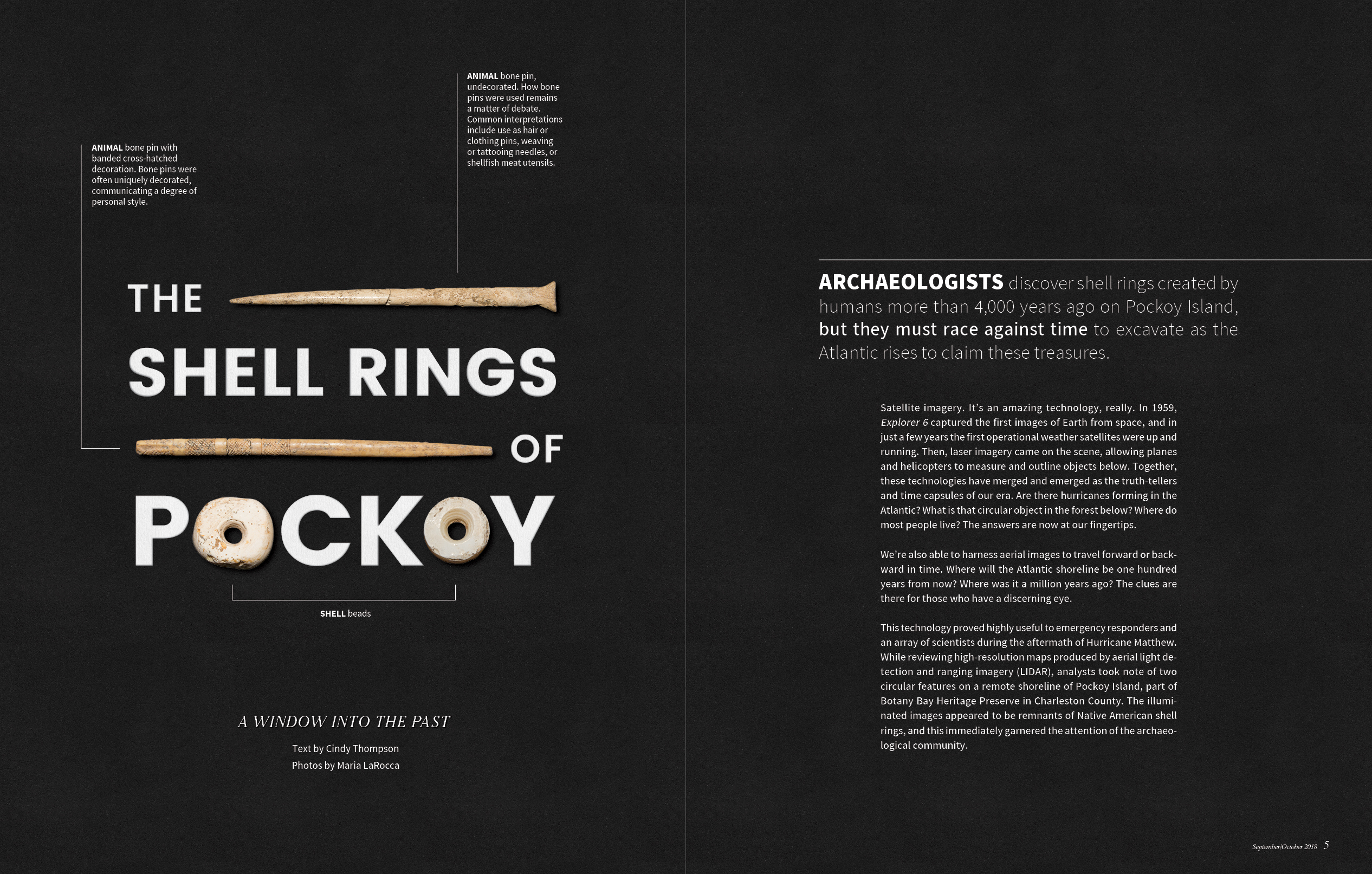
The Shell Rings of Pockoy
This design was part of the opening spread for an archaeology story in South Carolina Wildlife magazine. After discussing the story with my team, I planned the layout, having seen some of the artifacts and knowing they could be well-integrated with the title. Then I coordinated a photo shoot of the artifacts and put the layout together using Photoshop and InDesign. In order to give the reader some context, I asked the associated archaeology experts for short descriptions of each artifact. I wanted the exciting findings from the dig to be the first thing the reader saw, the hope being that that would spark their interest and curiosity.
First Place - Graphics/Layout, 2019
Association for Conservation Information (ACI)
- This design was awarded first place in the Graphics/Layout category for outstanding design in conservation information at the 2019 Association for Conservation Information (ACI) conference in Savannah, Georgia. The Graphics/Layout category includes magazine article designs, sign or series of signs, presentation graphics, infographics and exhibit graphics.
- The non-profit ACI association is made up of information and education professionals representing state, federal and Canadian agencies and private conservation organizations. Member professionals play a major role in providing natural resource, environmental and wildlife outreach initiatives to the public through a variety of means, many of which are continental in scope.
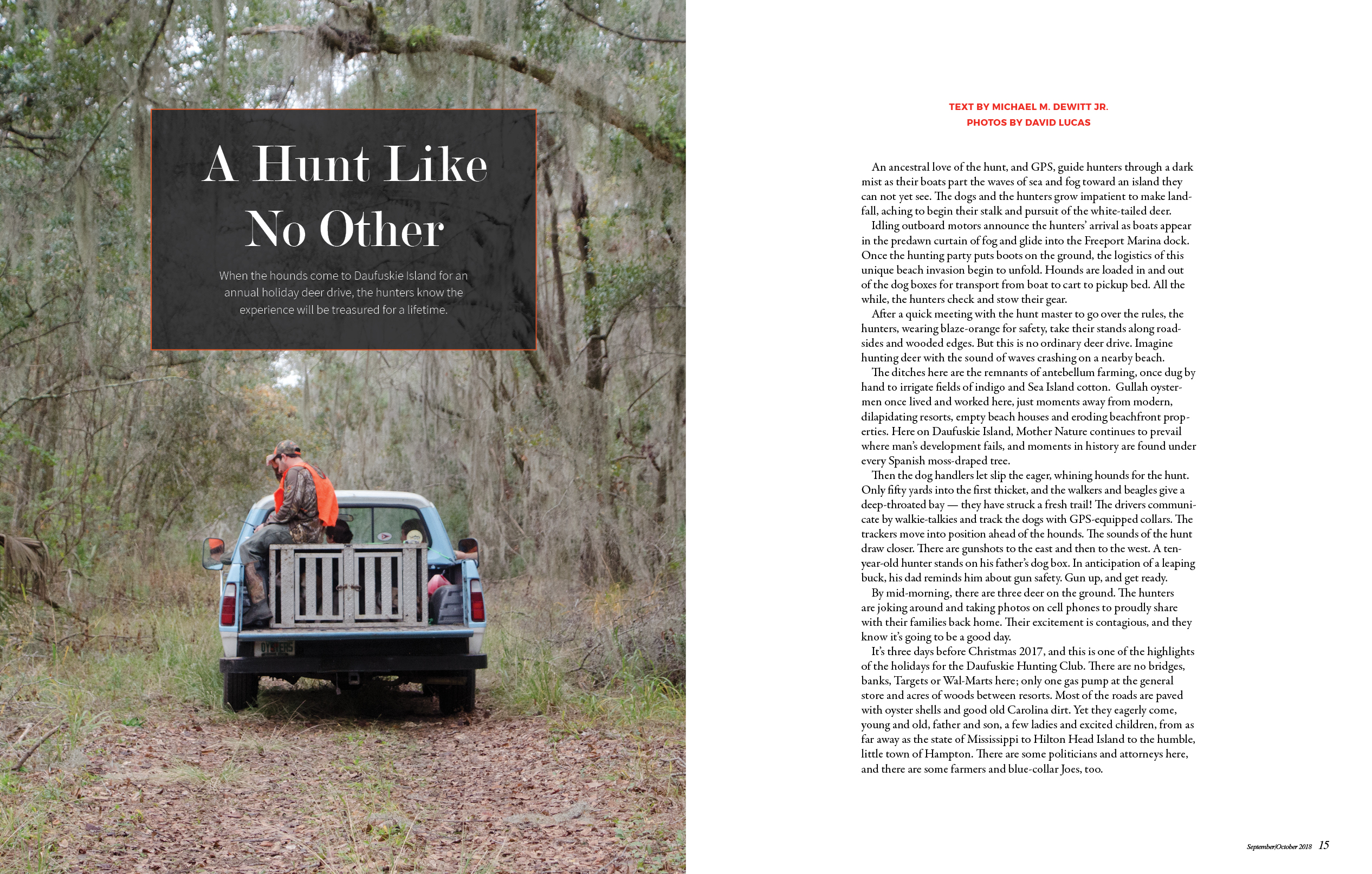
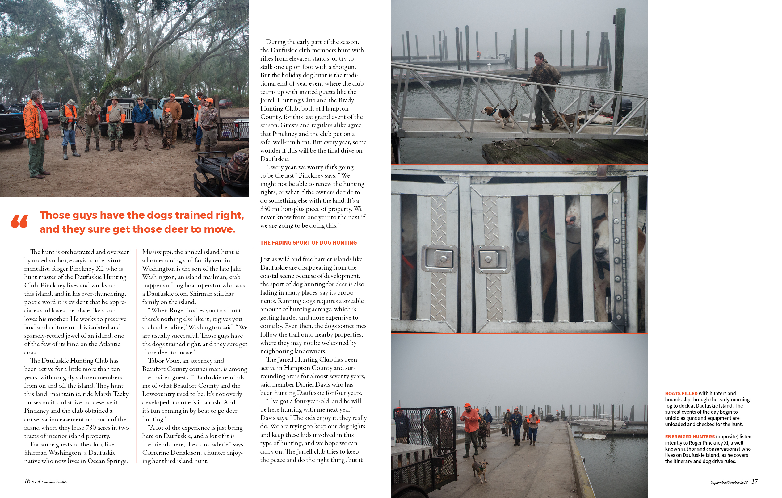
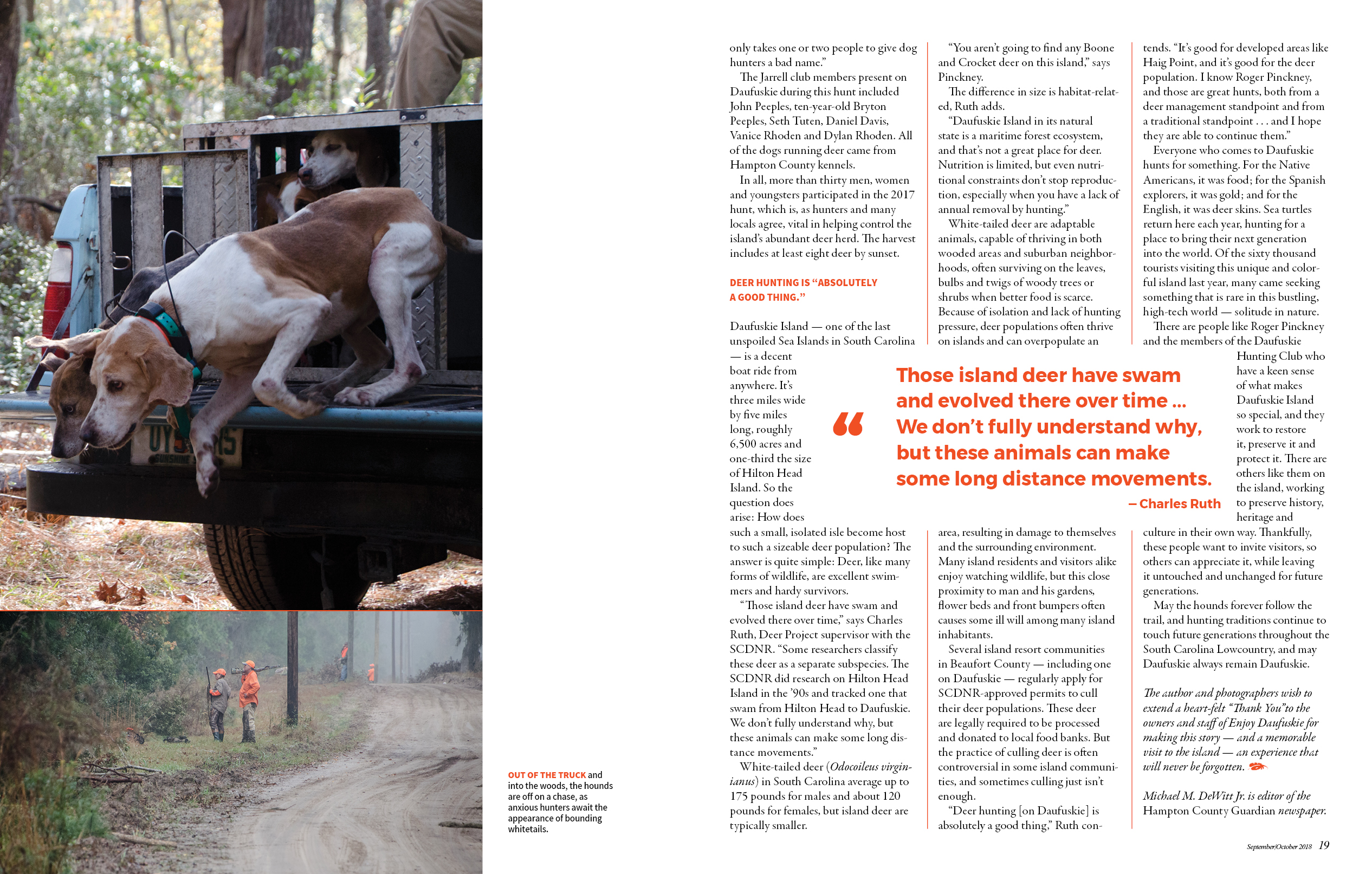
A Hunt Like No Other
This article tells the story of a hunting trip at Daufuskie island, SC. After reading the story, I chose the photos that I felt best suited the story, included a variety of angles (wide and close up) and worked well with each other in terms of color. I wanted the reader to feel as if they were there at Daufuskie island as the story was being told, so I put the images in chronological order to match the article. Then I tied everything together using the bright orange, the color that is associated with hunting and that makes an appearance on the clothes the hunters are wearing in the photos.
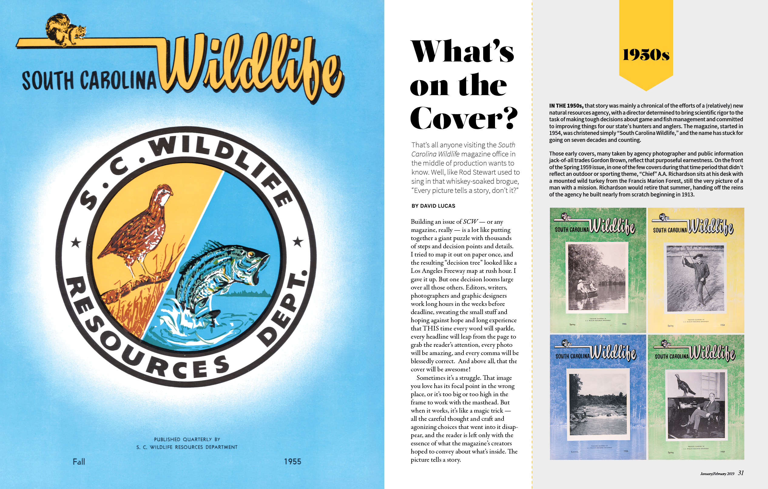
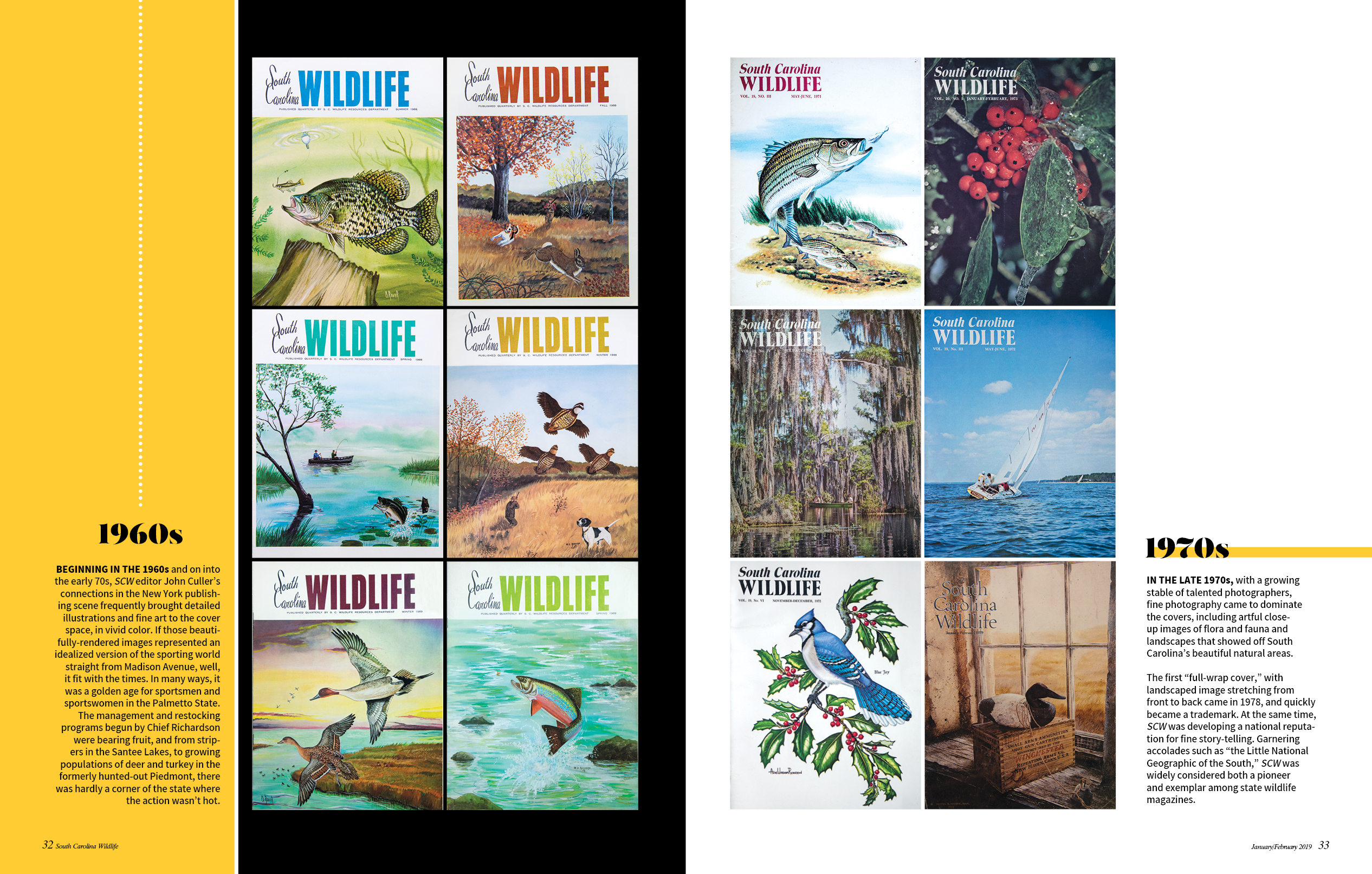
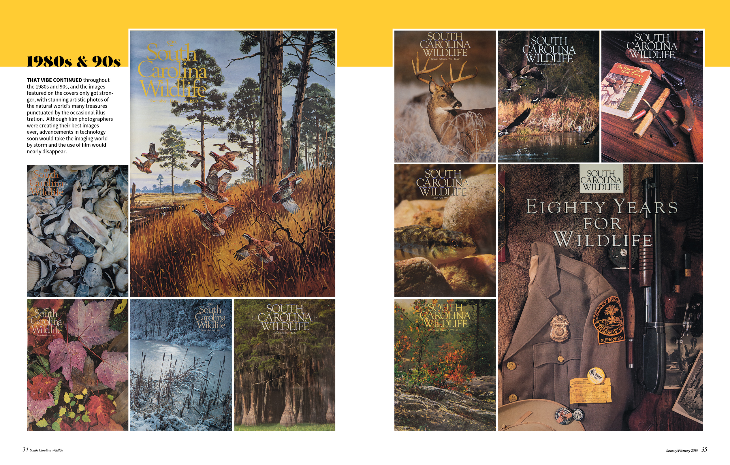
What's on the Cover?
This piece was a feature article from SCW's 65th anniversary issue in January 2019. I wanted to take the reader through the decades of our cover designs for this special issue. With different nameplates to represent different decades, this made for a visually interesting way to show the readers what changed over the years. How the sixties and seventies covers were mostly illustrations and how beautiful the film photos were from our past photographers. My goal was to use this article to celebrate South Carolina Wildlife magazine over the years.
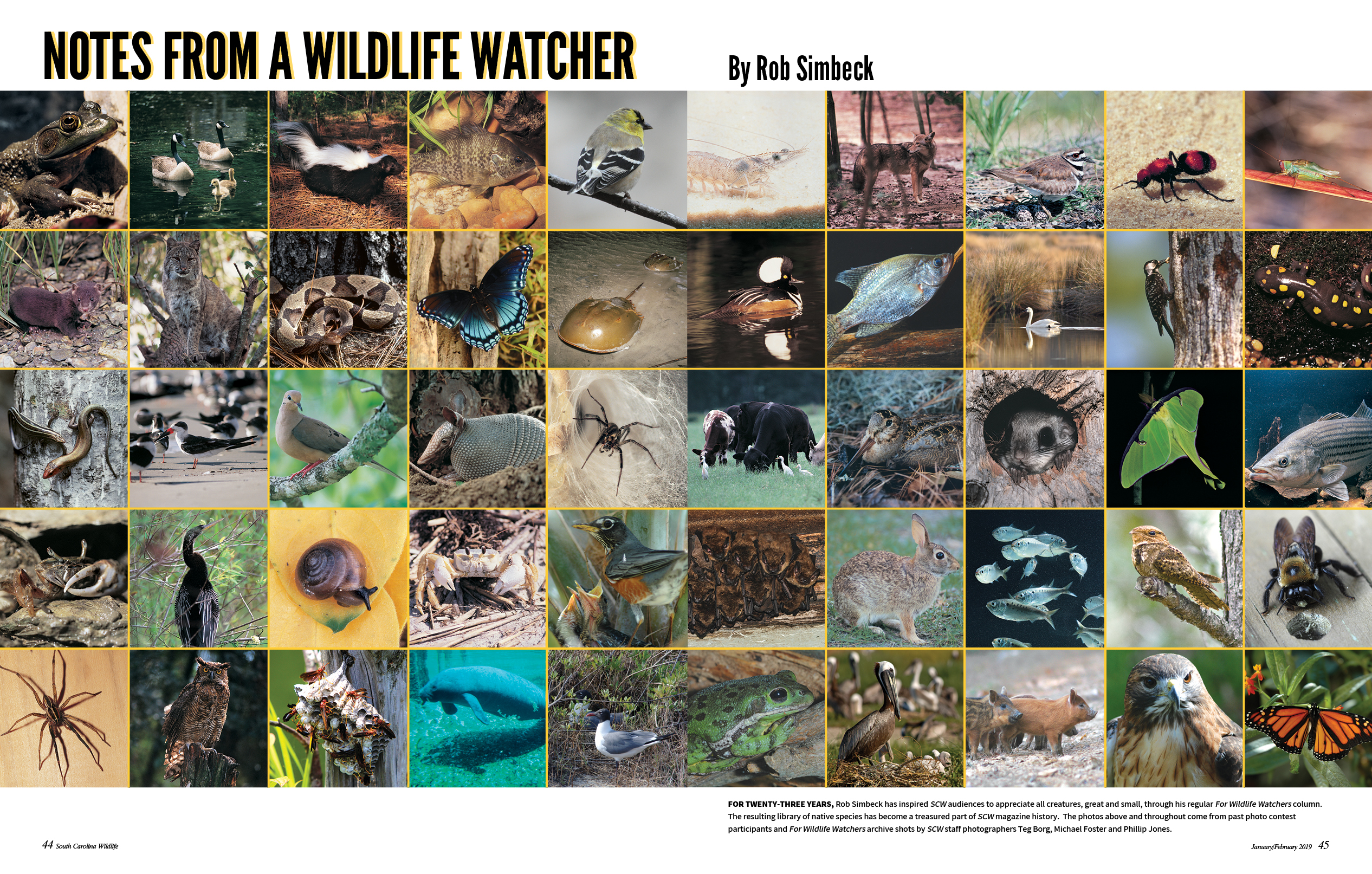
Notes from a Wildlife Watcher
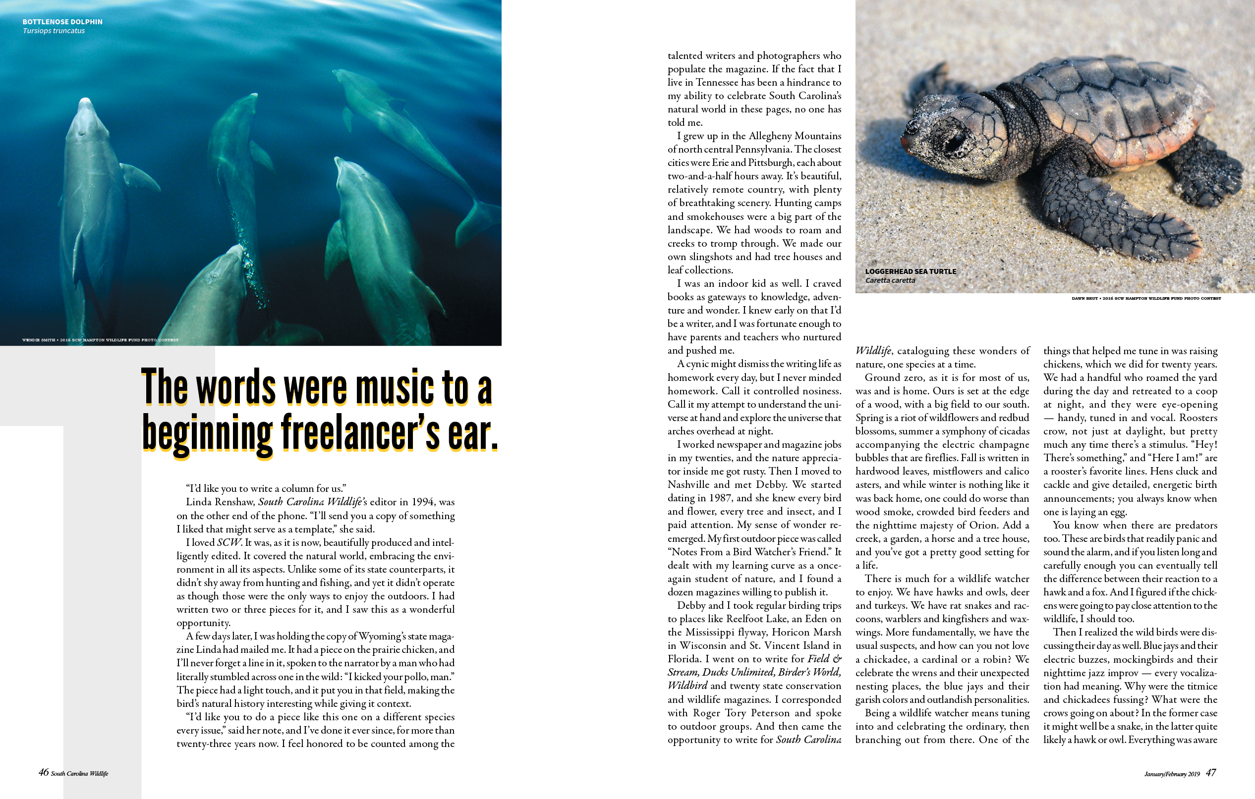
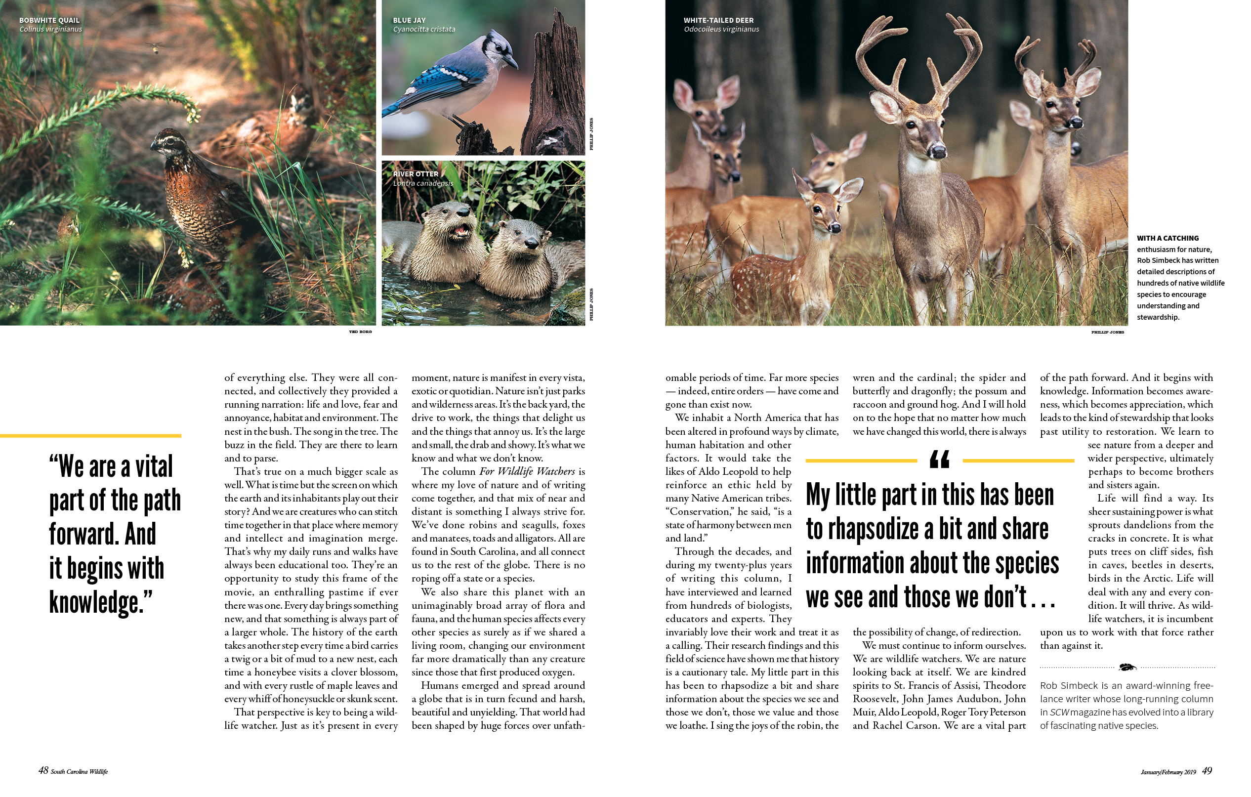
Because this article was a memoir of a writer who had been writing wildlife profiles for us for many years, I wanted to open it up with a collage of photos from his different wildlife profiles over the years. I went through the archives and found as many as I could and organized them in a way that showed off the variety of species and looked aesthetically pleasing. For the photos throughout the story, I chose wildlife that exist in different regions of SC, and wildlife that are well-known in SC. I created accents using the golden yellow color that runs through the whole anniversary issue to create a sense of cohesiveness.

